UI components/elements
- INPUTS
- Autocomplete
- Button
- Button Group
- Checkbox
- Floating Action Button
- Radio Group
- Rating
- Select
- Slider
- Switch
- Text Field
- Transfer List
- Toggle Button
- DATA DISPLAY
- Avatar
- Badge
- Chip
- Divider
- Icons
- Material Icons
- List
- Table
- Tooltip
- Typography:
- ex: Header, Paragraph, Body, Blockquote, Code, Highlight, Kbd
- FEEDBACK
- Alert
- Backdrop
- Dialog — Modal, Popover
- Progress — Loader
- Skeleton
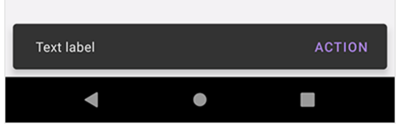
- Snackbar — Toast, Notification
- SURFACES
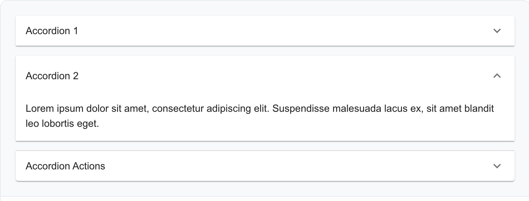
- Accordion — Chevron
- App Bar
- Card
- Paper
- NAVIGATION
- Bottom Navigation
- Breadcrumbs
- Drawer
- Link
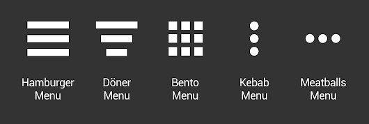
- Menu — Hamburger, Kebab
- Pagination
- Speed Dial
- Stepper
- Tabs
- LAYOUT
- Box
- Container
- Grid
- Stack
- Image List
- Specialised For Image Displaying
- Images maybe of same size or different size and their arrangement layout
- MISC:
- Date/Time/Timezone/Range/Calendar Picker
- Color Swatch
- Color Picker
- File uploader
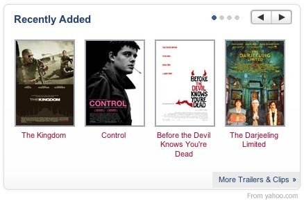
- Carousal
- Thumbnail
Reference Design Systems
Carousel
- Used to browse through multiple images and possibly select one of them
Accordion
- Show and hide sections of related content on a page.
Chevron is the icon which indicate the expand/collapse state of accordion menus. In the following example it is up/down icon:
Breadcrumbs
- Allows navigation up to any of the ancestors.

- Popover vs Snackbar
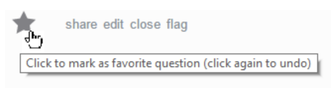
Tooltip:
- Used for showing hint or tip on hover
- short text
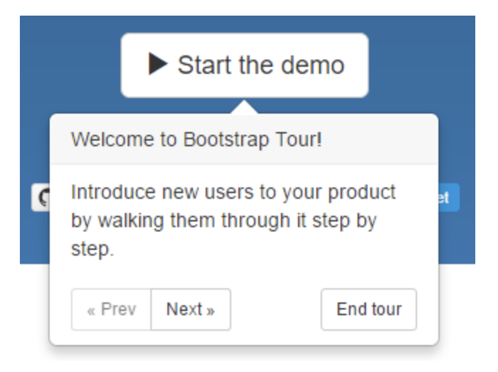
- Popover:
- Used for showing additional content
- Contains header/body/buttons etc.
- Disappear by user interaction
Toast vs Snackbar
- Toast vs Snackbar
- Toast:
- Generally used when messages are related to system or background service
- Don’t interrupt the user experience
- Disappear after timeout
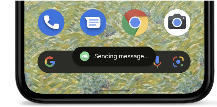
- Snackbar:
- Generally used to inform users of a process that an app has performed or will perform
- Don’t interrupt the user experience
- Disappear after timeout or swipe away or user interaction
- Can have optional actions such as Undo or Retry